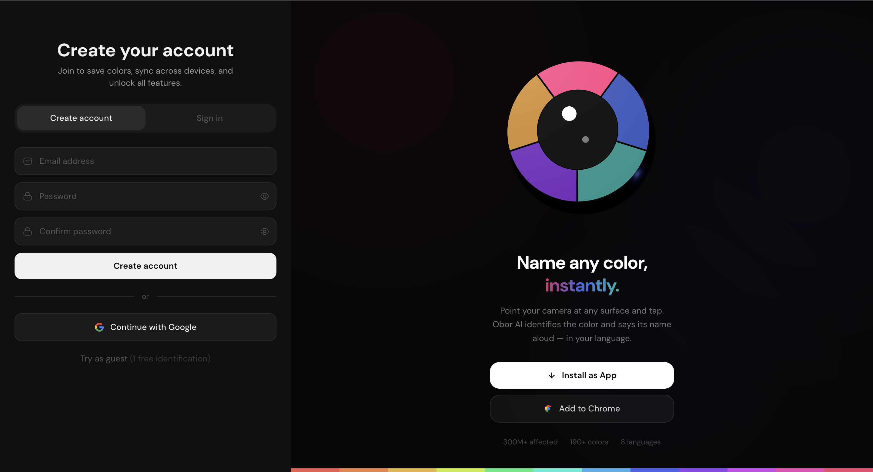
Obor AI — Color Identification for Everyone
- Role: Design Engineer (end-to-end)
- Product: Obor AI — useobor.ai
- Stack: React, TypeScript, Tailwind CSS v4, Framer Motion, FastAPI, Firebase, PostgreSQL, Astro
- Platforms: Progressive Web App · Chrome Extension · Marketing Site · Admin Dashboard
- Timeline: 2025 – 2026
Overview
Obor AI is a color identification tool that lets anyone point their camera at any surface — a wall, a flower, a fabric, a webpage — and hear the exact color name spoken aloud in their language. It uses Delta-E 2000 perceptual matching against a curated database of 190+ named colors across 12 color families, with text-to-speech output in 8 languages.
The product exists across four surfaces: a React PWA installable on iOS and Android, a Chrome extension for identifying colors on any webpage, an Astro marketing site, and a FastAPI backend with a PostgreSQL database. I designed and built every layer end-to-end — product architecture, visual design, frontend, backend, auth, deployment, and distribution.
The Problem
Color is one of the most universally difficult things to communicate precisely. Everyone has experienced the frustration of trying to describe a color they're looking at — "it's like a dusty rose, but more mauve." That problem is amplified for the 300 million people worldwide living with color blindness, for whom the gap between what they see and what they can name is a daily friction.
Existing tools were either buried in accessibility menus, required a data connection, gave vague answers, or assumed the user already knew the color vocabulary they were trying to learn. There was no fast, offline-capable, voice-first tool that treated color naming as a first-class problem for a broad audience.
The initial instinct was to build specifically for the colorblind community. Early user testing exposed a critical positioning mistake: when non-colorblind users encountered the product, their first response was "I'm not colorblind — this isn't for me." The product was self-selecting out the majority of its potential audience before they ever tried it. The problem wasn't the product. It was the framing.
Design System
The entire product runs on a single shared design language built in Tailwind CSS v4, using the @theme block to register semantic color tokens as CSS custom properties.
The most deliberate decision in the system was making the brand color purely monochromatic — #1a1a1a in light mode, flipping to #f0f0f0 in dark mode. No hue-based accent anywhere. In a product about color, a loud brand color would compete directly with the color being identified. The UI needed to disappear so the result — always a vivid color swatch — is the most dominant visual element on screen at any moment.
Core tokens:
@theme {
  --color-bg:               #f5f5f5;
  --color-surface:          #ffffff;
  --color-surface-elevated: #ffffff;
  --color-raised:           #f0f0f0;
  --color-border:           #e5e5e5;
  --color-text-primary:     #111111;
  --color-text-secondary:   #666666;
  --color-text-muted:       #aaaaaa;
  --color-brand:            #1a1a1a;   /* flips to #f0f0f0 in dark */
}
The PWA supports both light and dark themes via a data-theme attribute toggled by the user in Settings. The Chrome extension follows the OS via prefers-color-scheme. The landing page is dark-only — a deliberate editorial choice to give it a different visual register from the app.
A small set of shared UI primitives (Button, Dialog, Sheet, Avatar, Switch, Toast) are built on Radix UI with class-variance-authority for variant management. Animations use Framer Motion for component transitions and cubic-bezier(0.16, 1, 0.3, 1) — a spring-like ease-out — as the consistent motion curve across every reveal, slide, and sheet.
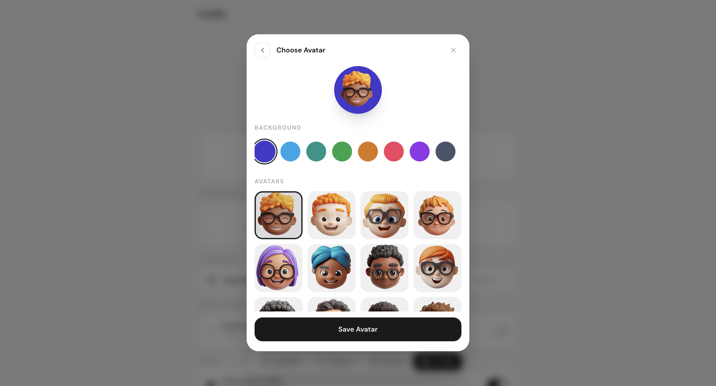
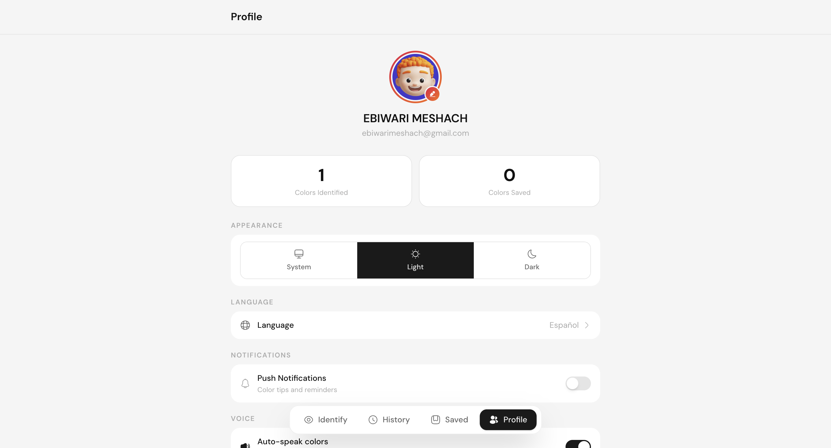
Here is the custom avatar selection and the profile customization flow in dark mode:
Auth Architecture
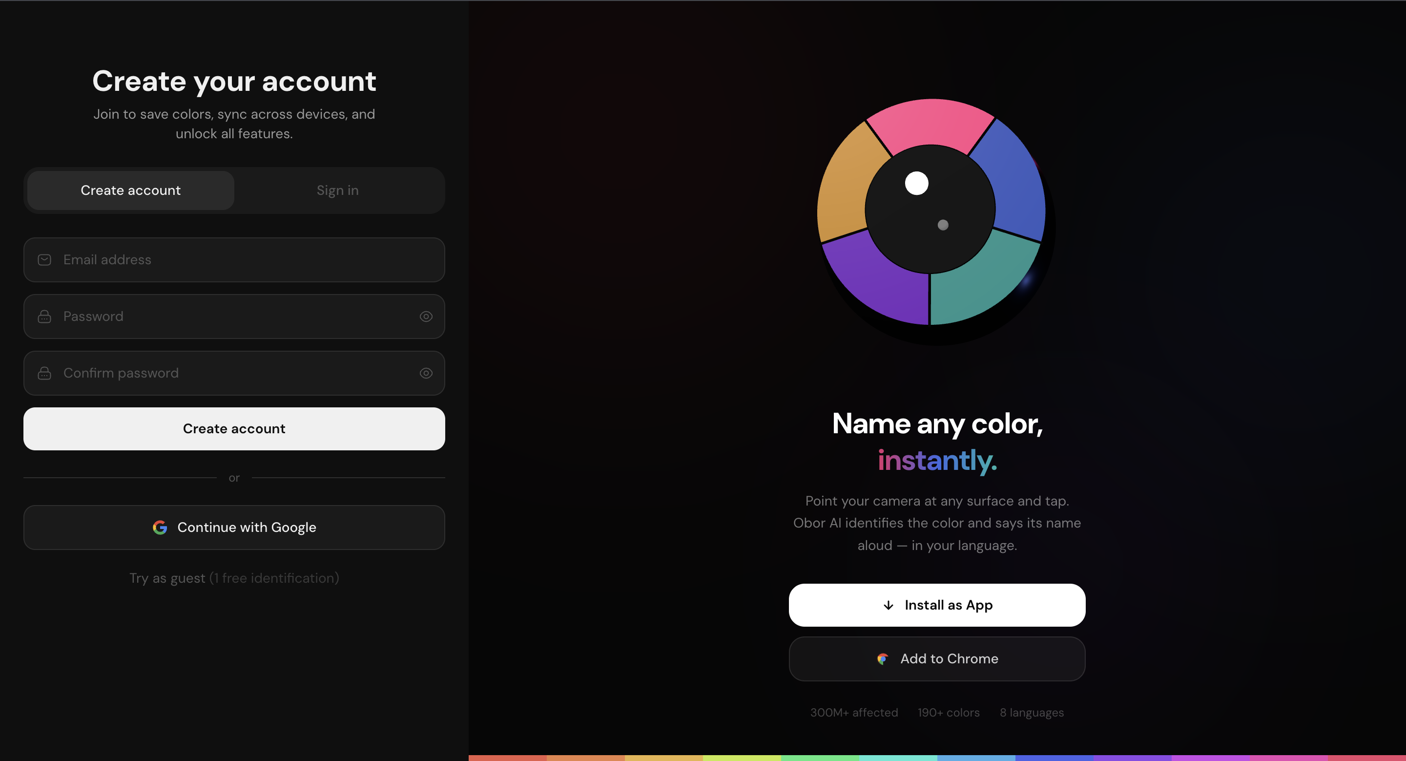
The original auth system used email/password login, Google OAuth via Firebase, and a full password reset flow. This was replaced entirely with a two-path system that removed passwords from the product:
Email OTP — a user enters their email, receives a 6-digit code, and enters it. The backend (POST /auth/request-otp → POST /auth/verify-otp) handles both new and returning users in a single flow, returning a JWT with is_new_user and needs_name flags that drive post-login routing.
Google sign-in — on mobile web, signInWithPopup was replaced with signInWithRedirect after discovering that iOS Safari blocks popup-based OAuth flows. getRedirectResult in the app root processes the return, syncs the Google profile to the backend, and routes accordingly.
The needs_name flag solved a specific product problem: users who signed up via Google had their display name populated automatically, but users who signed up via OTP did not. Rather than blocking the OTP flow to collect a name, the flag allows any login path to route the user to a name-entry screen post-auth if their profile is incomplete.
The Chrome extension previously used chrome.identity.getAuthToken for Google sign-in alongside email/password. When the Chrome Web Store rejected the extension for non-functional OAuth2, the extension auth was updated to mirror the PWA: email OTP + chrome.identity Google sign-in, with passwords removed entirely.
Color Engine
The identification engine runs entirely on-device. No images or pixel data are sent to any server.
The process for a single tap:
- Sample the pixel at the tap coordinates from the canvas
- Convert the RGB value to CIELAB color space
- Run Delta-E 2000 against every entry in the color database
- Return the closest perceptual match with its name, family, shade, hex, and WCAG contrast values
Delta-E 2000 is the industry standard for perceptual color difference — it models how the human visual system actually distinguishes colors rather than calculating raw RGB distance, which fails badly on low-saturation and near-neutral colors.
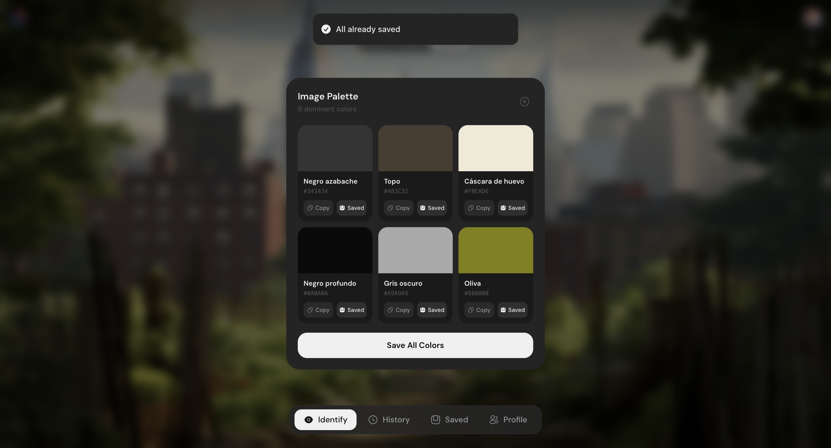
For palette extraction, a k-means clustering algorithm runs directly against the canvas pixel data, grouping up to 2,000 sampled pixels into 6 centroids and running each through the same Delta-E matching pipeline.
The WCAG contrast checker computes relative luminance from RGB via the W3C formula and returns the contrast ratio with AA (4.5:1) and AAA (7:1) pass/fail verdicts against the standard thresholds.
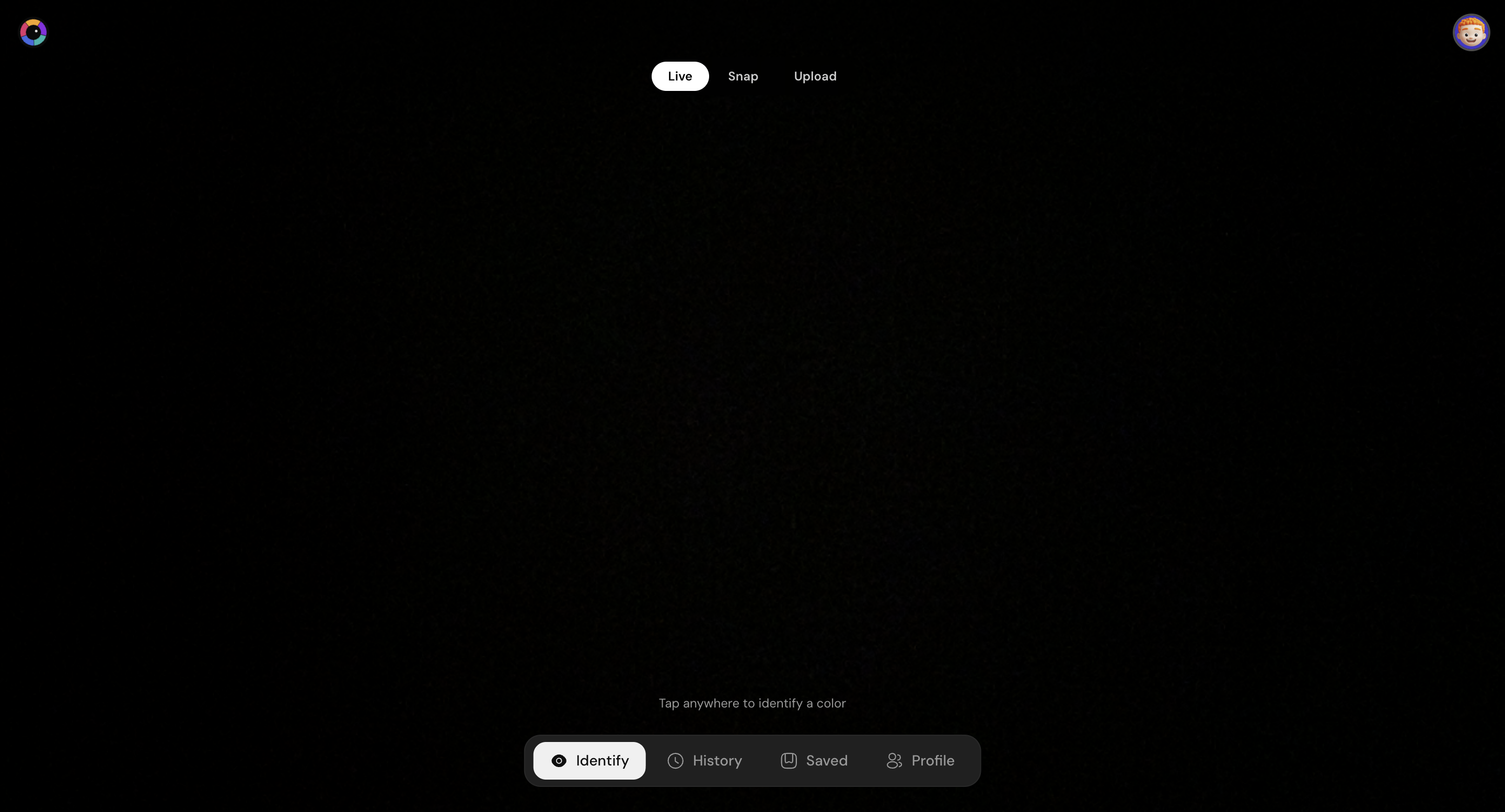
The camera-view reticle and the perceptual matching result show how the color is identified, alongside the extracted image palette:
Platforms
Progressive Web App
The PWA is a React application installable on iOS and Android directly from Safari or Chrome without an App Store. The camera feed is rendered into a canvas element; tapping anywhere samples that pixel and runs the color engine synchronously. Results animate in via a bottom sheet on mobile and a centred modal on desktop, driven by Framer Motion with spring physics.
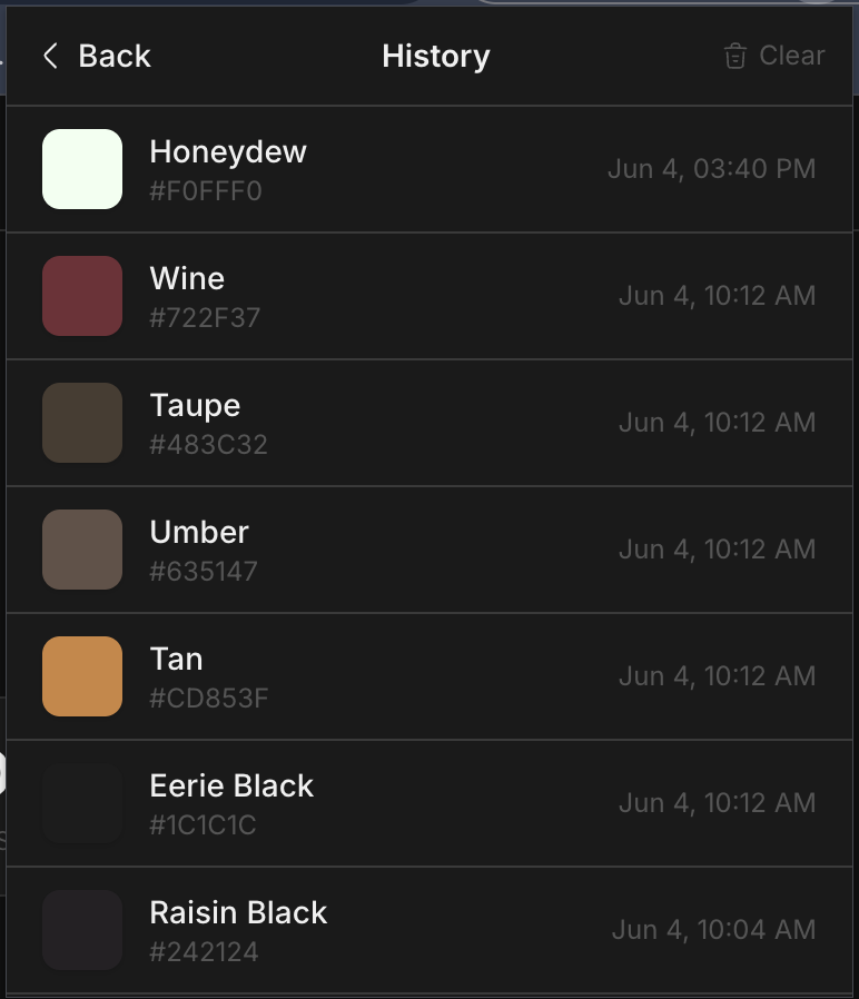
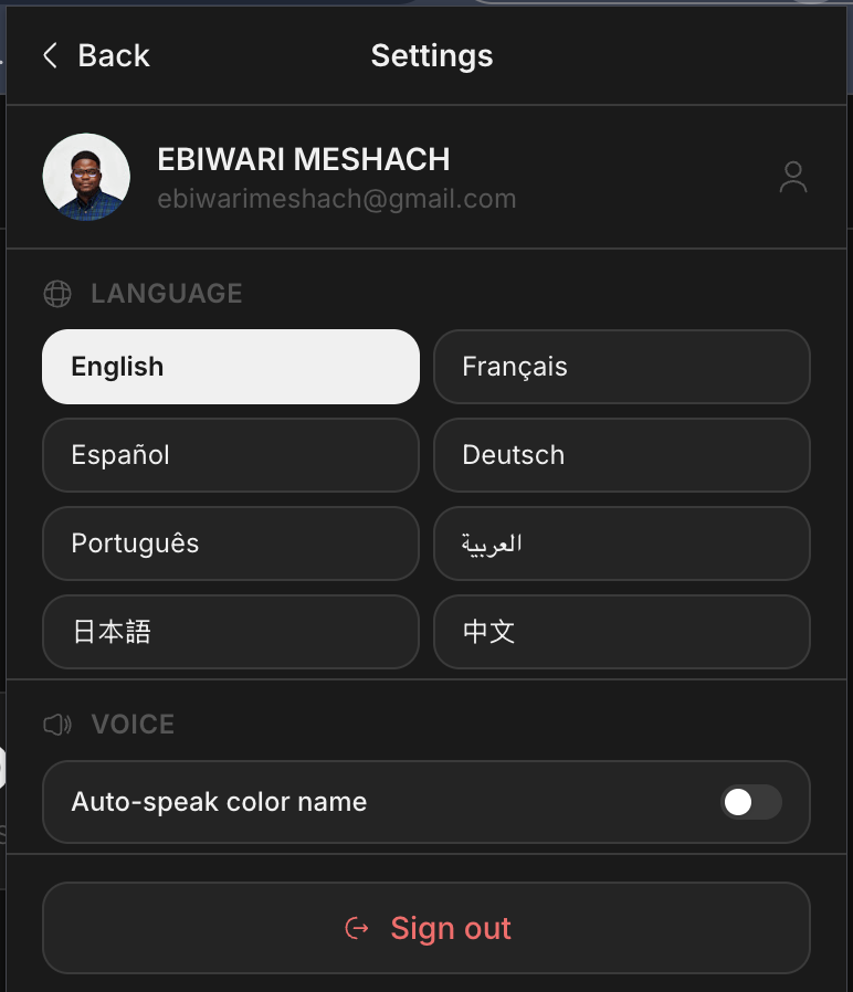
A persistent Zustand store (with localStorage sync) holds the user's auth state, color history, saved palette, language preference, and voice settings across sessions.
One recurring mobile-specific issue was the bottom sheet being clipped by the device's system navigation bar. The fix was positioning the sheet using calc(4rem + env(safe-area-inset-bottom)) rather than a fixed bottom-16, ensuring it always clears the full height of the nav bar including the safe area inset on notched iPhones.
User history log and global language/settings interface:
Chrome Extension
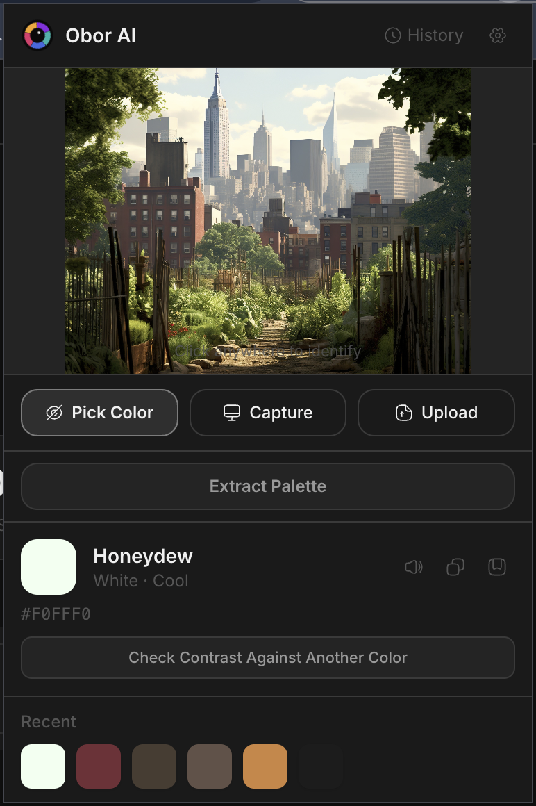
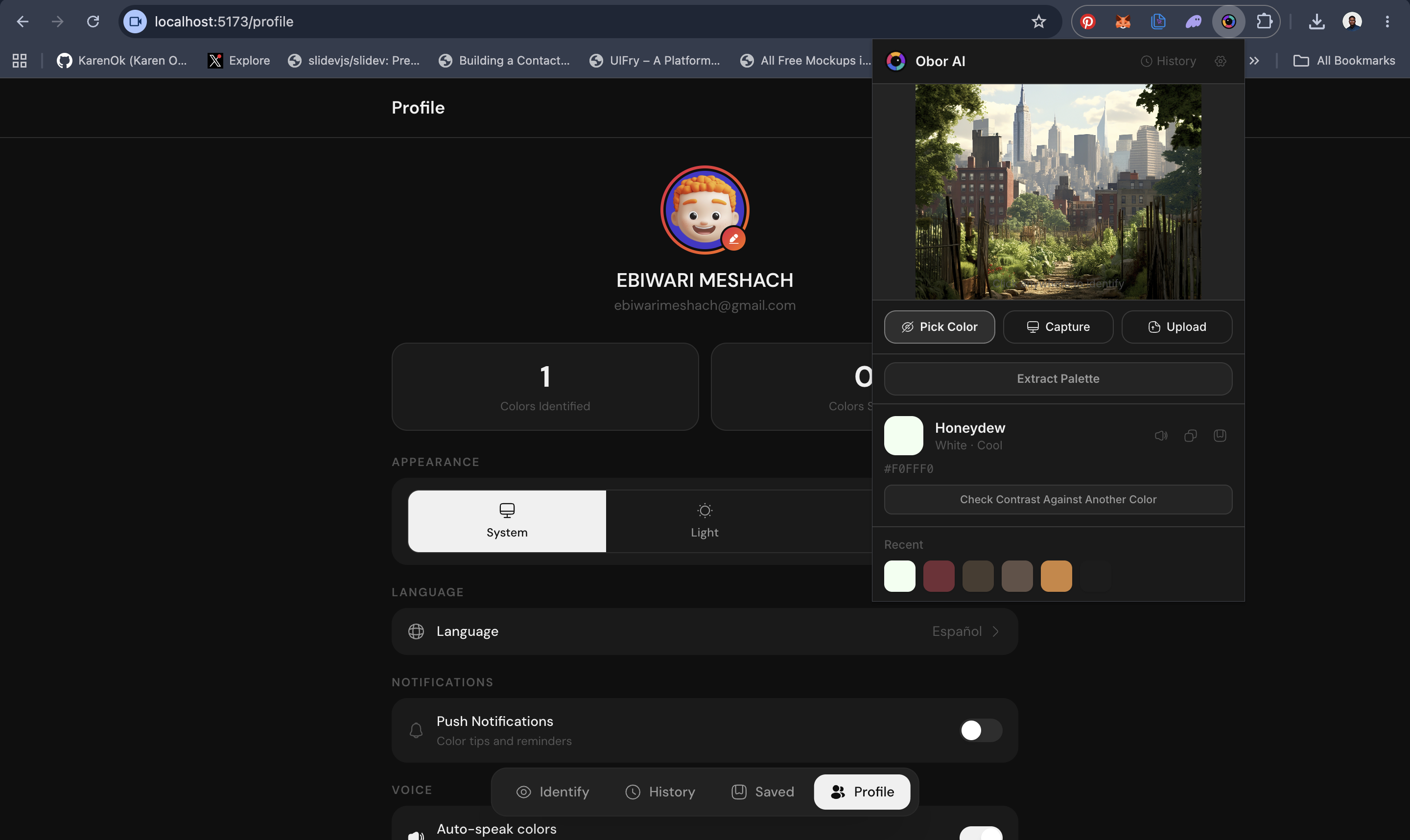
The extension is a 380px-wide popup built in React. It offers three color input modes: a crosshair picker injected into the active tab via chrome.scripting.executeScript, a screenshot of the visible tab via chrome.tabs.captureVisibleTab, and image upload. All three feed the same canvas-based color engine.
A content script (picker.js) handles the crosshair injection and communicates identified colors back to the popup via chrome.storage.local, which the popup watches with chrome.storage.onChanged.
Landing Page
The marketing site is built in Astro with Tailwind CSS v4. It uses Three.js for the interactive 3D eye in the hero section — a WebGL iris with segmented color panels that react to the cursor position, each segment lighting up as the mouse angle aligns with it. Scroll-triggered reveal animations use an IntersectionObserver with staggered delays per grid item.
The Positioning Rewrite
The original landing page, onboarding flow, and all metadata were framed exclusively around color blindness. Testing revealed the problem: non-colorblind users immediately self-excluded. The phrase "for people with color blindness" appeared in the hero description, the stats section, the features editorial, the footer, the page title, the meta description, and the onboarding slide deck.
The rewrite restructured the hierarchy:
- Lead with the universal — "See a color anywhere. Know its name." applies to everyone.
- Name the specific audiences — kids learning colors, designers needing precision, people with color blindness.
- Move the accessibility stat down — the 300M colorblind figure is still present, but as supporting context, not the opening argument.
Changes touched seven files across the landing page and PWA: hero description, stats section (replaced the colorblind population stat with product capability stats), features sidebar editorial, a new FAQ entry ("I'm not colorblind — is this still useful for me?"), two of four testimonials rewritten with non-colorblind personas, the onboarding slide rewritten from "Built for color blindness" to "Works for everyone", and all SEO metadata updated to reflect the broader positioning.
Tradeoffs
Font inconsistency shipped knowingly. The PWA uses DM Sans; the Chrome extension and landing page use Inter. Unifying them mid-build would have added bundle weight and build complexity at a moment when shipping mattered more than pixel-perfect consistency. It is logged as design debt.
No shared component package. The PWA and Chrome extension duplicate several UI patterns — OTP input, auth form, toast handling — rather than pulling from a shared package. A monorepo with a @obor/ui package would eliminate this, but the overhead of setting it up was not justified at this stage.
OTP for returning users adds one extra step. Removing passwords made auth simpler and more secure, but a returning user who previously used a password now has to wait for an email. The tradeoff was accepted because OTP eliminates an entire class of security issues (password reuse, reset flows, storage) and the email delivery is fast enough in practice not to feel like friction.
Final Note
Obor AI is the kind of product where the interesting problems are not where you'd expect them. The color engine is the obvious hard part — but the actual challenges were positioning (who is this for?), auth fragmentation across platforms (popup vs redirect vs chrome.identity), mobile browser quirks (iOS safe areas, Safari popup blocks), and Chrome Web Store policy compliance. Shipping across four surfaces simultaneously means every architecture decision echoes further than it would in a single-platform product. The constraint made every decision more considered.